Our company logo through the ages
In this story, you will learn more about how our logo has changed in over 145 years of company history.
Company logos – an integral part of a brand’s identity
The star on the vehicles of a certain Swabian car manufacturer, the golden M of a well-known fast food chain or the apple with a bite mark belonging to a global technology company – logos are an important element of a company’s external communication measures. They make the brand identity visible and help to make a brand instantly recognisable. Here we take a look at the development of our own corporate logo in over 145 years of company history.
A wholesale hardware business for mining companies, among others: the first Böllhoff logo
It all started with the simple lettering “WB 1877”, composed of the initials of our founder Wilhelm Böllhoff and the year his company was founded. This lettering not only appeared on a window at Böllhoff’s first location in Herdecke, but also became a central element in the first company logo.
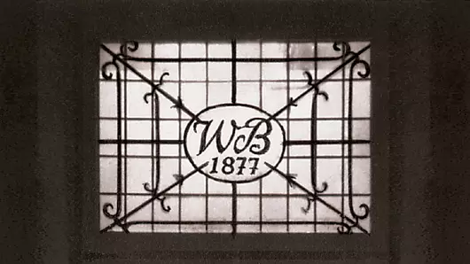
Striking: A hint towards our core business as well as an important customer group of the early days found their way in as well. The outline of a hexagon nut formed the outer boundary of the logo: a reference to our company’s activities as a hardware wholesaler. In the centre of the logo was the hammer as a symbol for the mining industry. Miners were among the most important customer groups of our still young company, along with forgers and metalworkers.
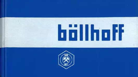
The “WB 1877” logo was used over two entire family generations, for around 100 years. At some point it was joined by stylised versions of our company name Böllhoff as a word mark – for example written as BÖLLHOFF or böllhoff. Both design elements, the “WB 1877” logo and the word mark, could be found, for instance, on a price list from 1973.
Creating visible connections – the Böllhoff parabola
Böllhoff developed significantly as a company in the 1950s and 1960s. After acquiring the HELICOIL® licence in 1954, we began to manufacture fasteners ourselves for the first time – in addition to our existing business as a wholesaler. When the third generation of the Böllhoff family took over the company, Böllhoff also increasingly entered international markets. As company manager, Dr Wolfgang W. Böllhoff first expanded to Austria in the 1960s, then to Brazil and Mexico. After all these developments the existing logo no longer seemed sufficient.
»"Production became more and more essential, also in our strategies. So I asked myself: Is this logo with hammer and mallet – Wilhelm Böllhoff, 1877 – aimed too much at the wholesale part of our business?"
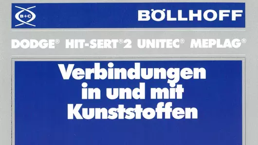
As a result of these thoughts, the Böllhoff parabola was created in the early 1970s – as a new company logo, as a visible sign of further development. The two intertwined parabolas symbolise connections. Connections that Böllhoff creates for its customers, but also the personal connections of the people behind the company’s success. It took until the 1980s, however, for the Böllhoff parabola to reach its final form: combined with the BÖLLHOFF lettering underneath it. Before that, several other versions of the logo had been in use. For some time, the two intertwined parabolas stood alone or were complemented by the letters B + C in the middle of the logo. B + C stood for Böllhoff & Co., our first company that was involved in the production and distribution of what we call special fasteners today.
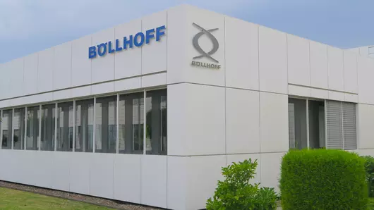
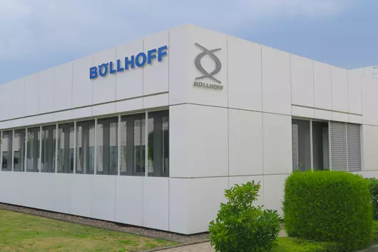
A future needs a past, also when it comes to the logo
Both the BÖLLHOFF word mark and the parabola – stylistic elements deeply rooted in our history – are still with us today. By now, the word mark BÖLLHOFF in Böllhoff Blue has become the main logo of our group of companies. Depending on the application, the Böllhoff parabola complements this main logo as a subordinate design element and makes our passion for successful joining visible – the vision that drives us day after day.